Sell the sizzle, not the steak
I’ve always hated that Silicon Valley cliche. I know people saying it think they are smartly pointing out that people buy for reasons other than pragmatic ones. We want products that make us feel cool, sexy and superior.
That focus on marketing can also lead to inferior products like fruit and vegetables that look good in the store but don’t taste all that great because they were selected for color and shape. That’s what sells.
We’ve all been fooled by too many organizations that spent most of their funds on marketing and whether “charities” or businesses, delivered too little because they had exhausted their resources convincing us to buy.
Four years ago, when we were just getting started and did our first exhibit at the National Indian Education Association, Erich Longie said to me,
We need a demo. We’d be able to sell more games if we had a demo that didn’t require internet and that allowed us to jump to parts of the game to show off the best features.
He was right and yet, we didn’t do it for over a year.
Instead, we spent the next year improving the games students would actually play in their classrooms. We fixed the steak instead of the sizzle.
Once we finished the demo, it had several things that Erich recommended. You could play it off line so you didn’t need internet access. You could skip over the registration and start in on the game play.
That was three years ago.
Since then, we did two upgrades of Spirit Lake: The Game, which teaches multiplication, division and Dakota history and we went ahead to make more games, Fish Lake, to teach fractions, Forgotten Trail , which runs on Chromebooks and teaches statistics,
Making Camp, that runs on just about anything.
We made our first bilingual game, then we started a whole series of bilingual games for the iPad. We created dozens of resources for teachers, a youtube channel of teaching videos , validated tests to assess whether students were learning, collected years of data, made reports for teachers to see student progress.
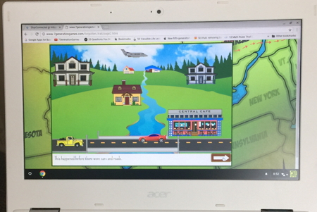
THREE YEARS LATER … our demo still looked like this.
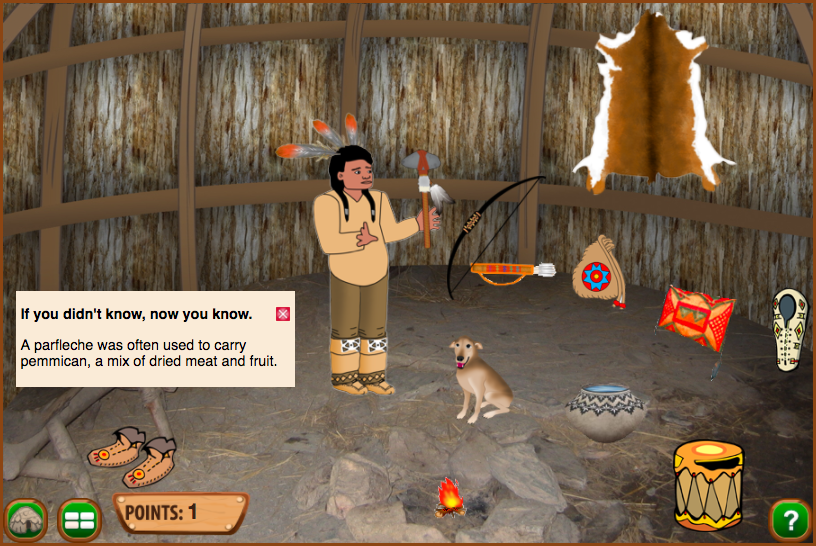
We finally got around to upgrading in the last month and now it looks 1000% better. The picture above is still in it but Tati, also known as “The Art Gal” is slaving away on every bit of it and it will be another 50% better again when we add the last of her revisions. As evidence, see the new page she did, below.
Sorry, not sorry
You might be wondering why the heck we did not make all of these changes years ago. In fact, we made a conscious decision to focus on the steak. That is, we made better products on more devices to serve more students and only then did we turn to the “sizzle” of fancier demo versions.
If we had large bags of money, we could have done both at the same time, but since the million dollar investor checks must have gotten lost in the mail, we had to prioritize.
Would we have gotten more sales if we’d done it the other way? Maybe in the short term. You know what, though, I hate those shiny red strawberries that really aren’t ripe and I now buy my produce at the farmer’s market.
I’m trying to be the solution instead of the problem, and I have to believe that in the long-run it will pay off.

