I have wanted for a long time to revisit Fish Lake and make all of the improvements our wonderful users have suggested but other responsibilities (prototypes we had a grant to develop) took priority.
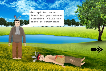
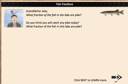
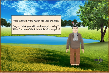
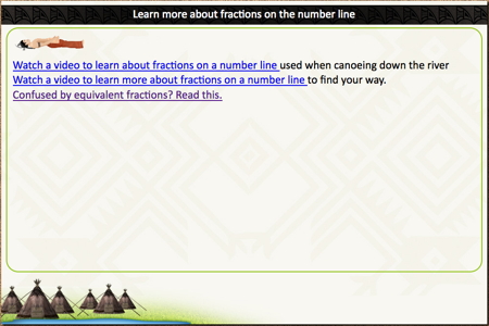
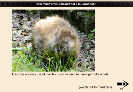
We have been working on this revision as we could scrape away time, and lately we’ve been able to do a lot of more. I’ve had posts here and there showing the differences but maybe a lot in one place would make more of an impression. This post focuses on the graphics. In short, we had been advised that we needed better graphics by many people, and we have been adding these as time and money allowed.
Take a look:
There are hundreds of these changes. Each one is a minor difference but they add up to make a better game experience.
It’s not just the game part that is being improved, though, but the education … and that is my next post.

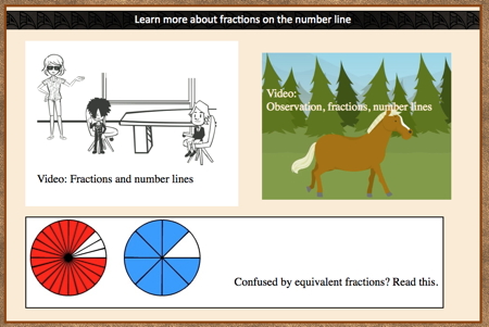
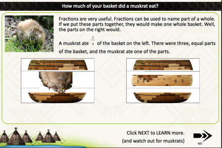
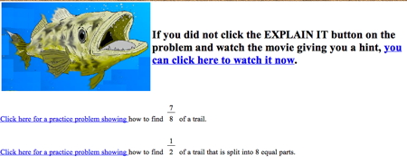
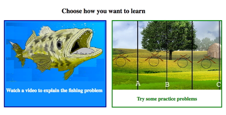
I believe these improvements will really allow the students to understand the skills and concepts taught. Providing choices allows students to match their learning style to the instruction. Keep up the excellent work and I appreciate the updates you provide me on your products.
Thank you! Coming from you, that means a lot. We will have the updated Fish Lake done in a couple of weeks. We are very excited about it.