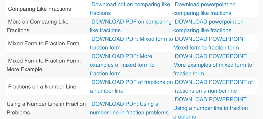
I am a bit embarrassed to say this but someone “improved” our teacher resources pages a while back and the results were, well see for yourself. Even worse, this page, and more like it, were around for a while before I caught the problem. (Keep reading, it does get better.)
Now, I’m sure the person who did this had the best of intentions, but, honestly, if you have a column that says PDF and another that says Powerpoint do you really think a teacher needs to be told 50 times on the same page to click to download? Why do we need a title column to tell them the title that is already given TWICE for the pdf and PowerPoint?
This is particularly discouraging because we have some really good content but you’d never guess it from glancing at that page. The thing teachers ARE is busy and they aren’t going to dig through your site looking for what is useful to them or putting it in order, they have enough to do.
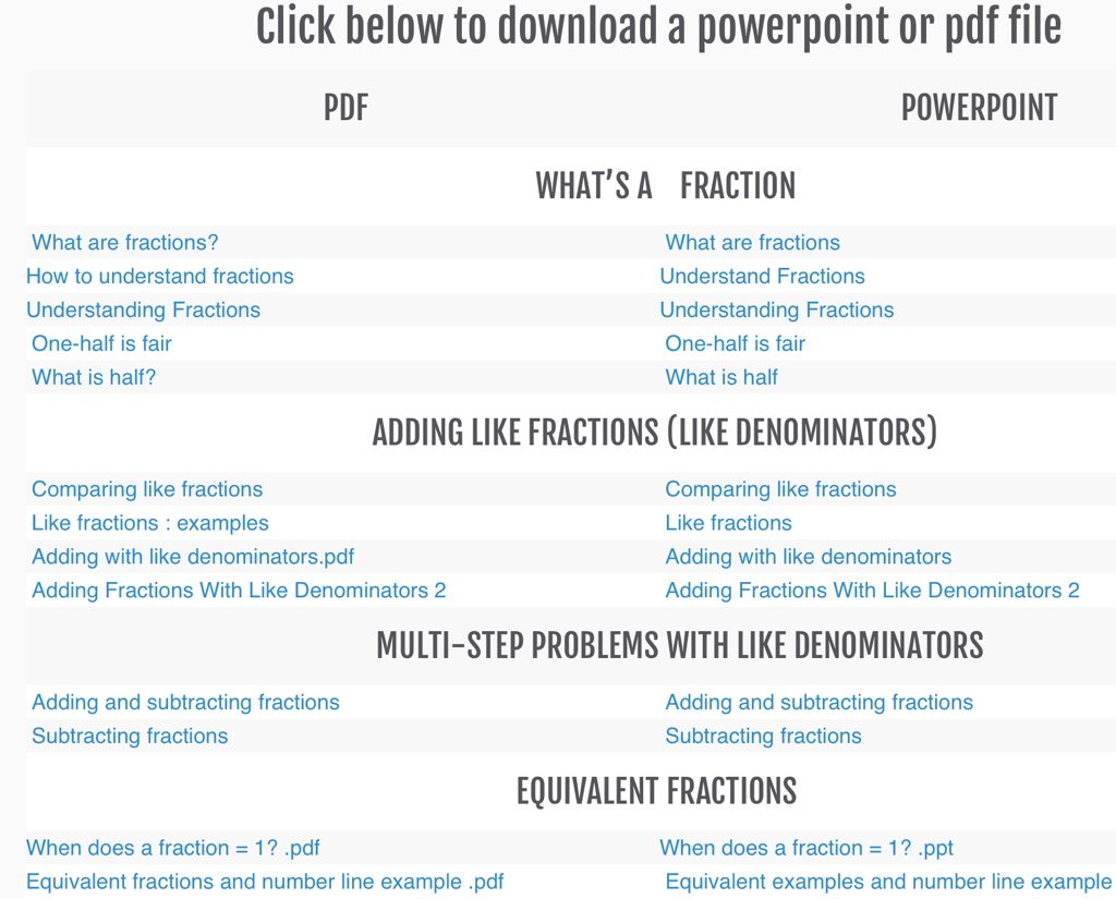
This is what the page looks like now, well, except for a few minor typos on this screen shot that I fixed later. You can click to check it out or you can read more and then click at the bottom of the page, because there’s more.
I spent a few hours tonight reviewing EVERY PowerPoint on the Fish Lake Teacher Resources page. Some of these had minor errors or wording that I thought was confusing. Some were okay but we aim for more than okay. In the years since some of these were written, we’ve identified points that need to be emphasized more heavily, for example, that when two fractions have the same numerator, the one with the smaller denominator is a larger number. (You know this to be true. Think about it for a minute.)
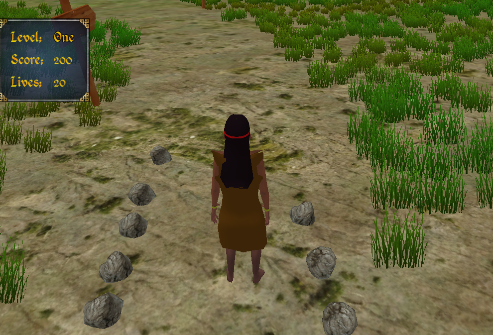
If you like the teacher resources, you’ll really like the game. Check that out, too.


