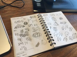
There was a lot of debate about what we should name our games to re-brand our company in Latin America. Luckily, we came to consensus on the name Strong Mind Studios. Strong Mind Studios embodies our belief that it is not only important to have a strong body, but to also have a strong mind. In fact, when Maria visited Trinidad and Tobago, the head of the T&T Sambo Federation, Jason Fraser, asked 7 Generation Games to partner with his Ruff & Tuff MMA promotion’s international event because athletic and academic success should be one in the same. (Make sure to check out our Strong Body, Strong Mind program for youth sports clubs). Now that we officially launched our Strong Mind Studios website, we are currently deliberating on the best logo design to represent the brand. Our graphic designer, Vlak, gave us 6 main logo design ideas to choose from.
AnnMaria and I like the first design with the brain lifting weight, but Maria likes that one the least. Diana prefers the simpler version of the brain lifting weight (the design right above number one). Maria Paz’s favorite design is number 5, the brain with the lightening bolt in the center, which Maria, AnnMaria, Diana, and I like as well.
As you can see, similar to deciding a name, there has been a lot of debate in deciding which logo to choose. That’s why we need your help. In the comments section of this post, tell us your top 2 favorite logos.


I see lots of great iterations. I am a graphic designer. My suggestion would be to focus on number 5…. Dive into multiple variations of that one.
Cheers
Thanks so much for your feedback! We also really like number 5 too.
I like No. 1 – I haven’t really seen anything like it before, but it goes well with the name Strong Mind Studios. I also like No. 5 because you can play around with the lightning bolt a bit and come up with variations.